Our small and agile frontend team was made of one designer (myself) and three developers. In this project, I was responsible for defining and implementing the design system, ensuring a cohesive and scalable visual language across the product.
Beyond design, I actively collaborated with developers in implementation sessions, bridging the gap between design and code. Leveraging my frontend development skills, I contribute directly to the codebase using  Visual Studio as my code editor—integrating new UI elements, refining interactions, and ensuring design fidelity. Additionally, I manage releases via
  GitHub, enabling a seamless and efficient design-to-development workflow.
Streamline design and development by reduing time spent on UI creation and implementation.
Ensures a uniform look and feel across all interfaces and products.
Centralized design rules ensure that changes propagate smoothly across products.
Bridges design and development with a shared language between designers and developers.
The design system serves as a single source of truth, for the current team but also potential new members.
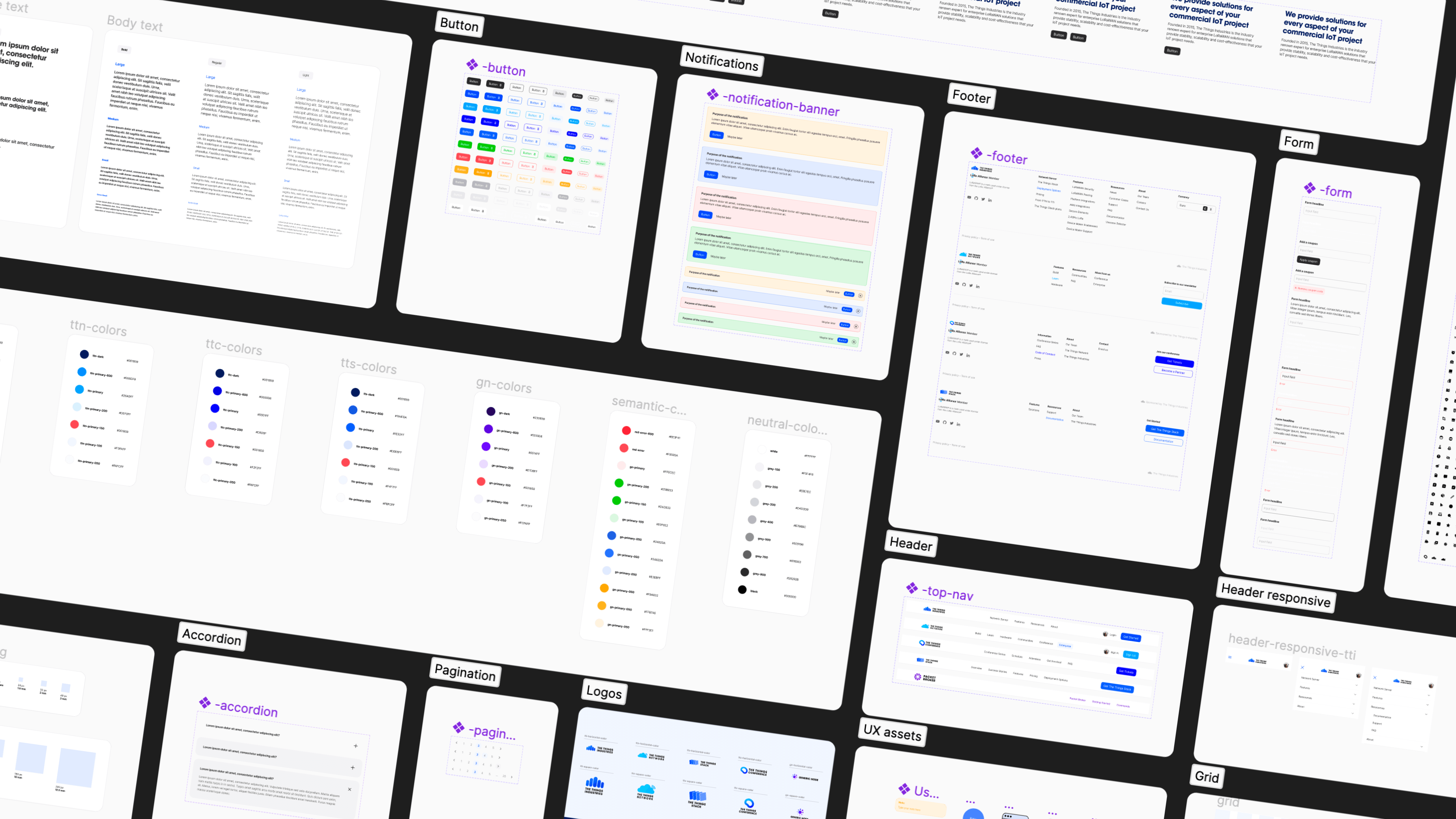
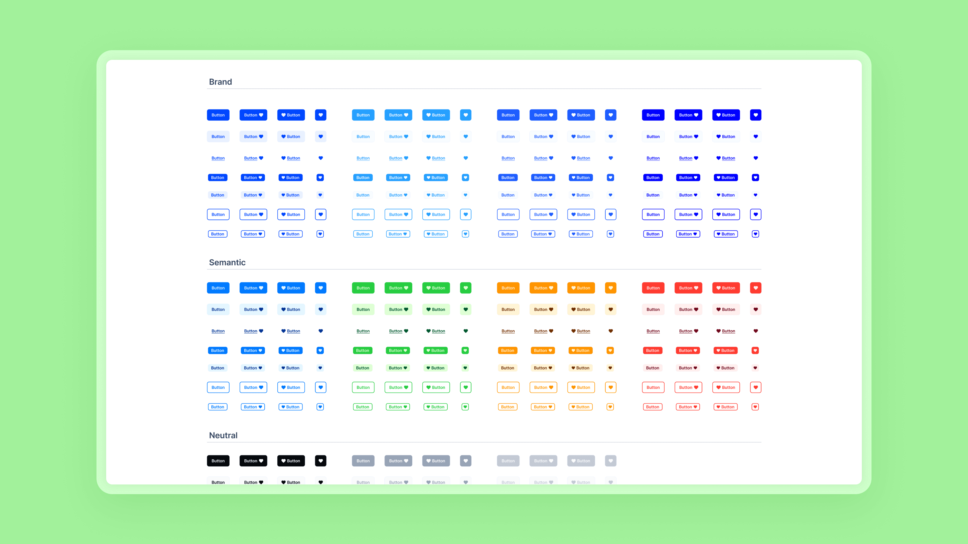
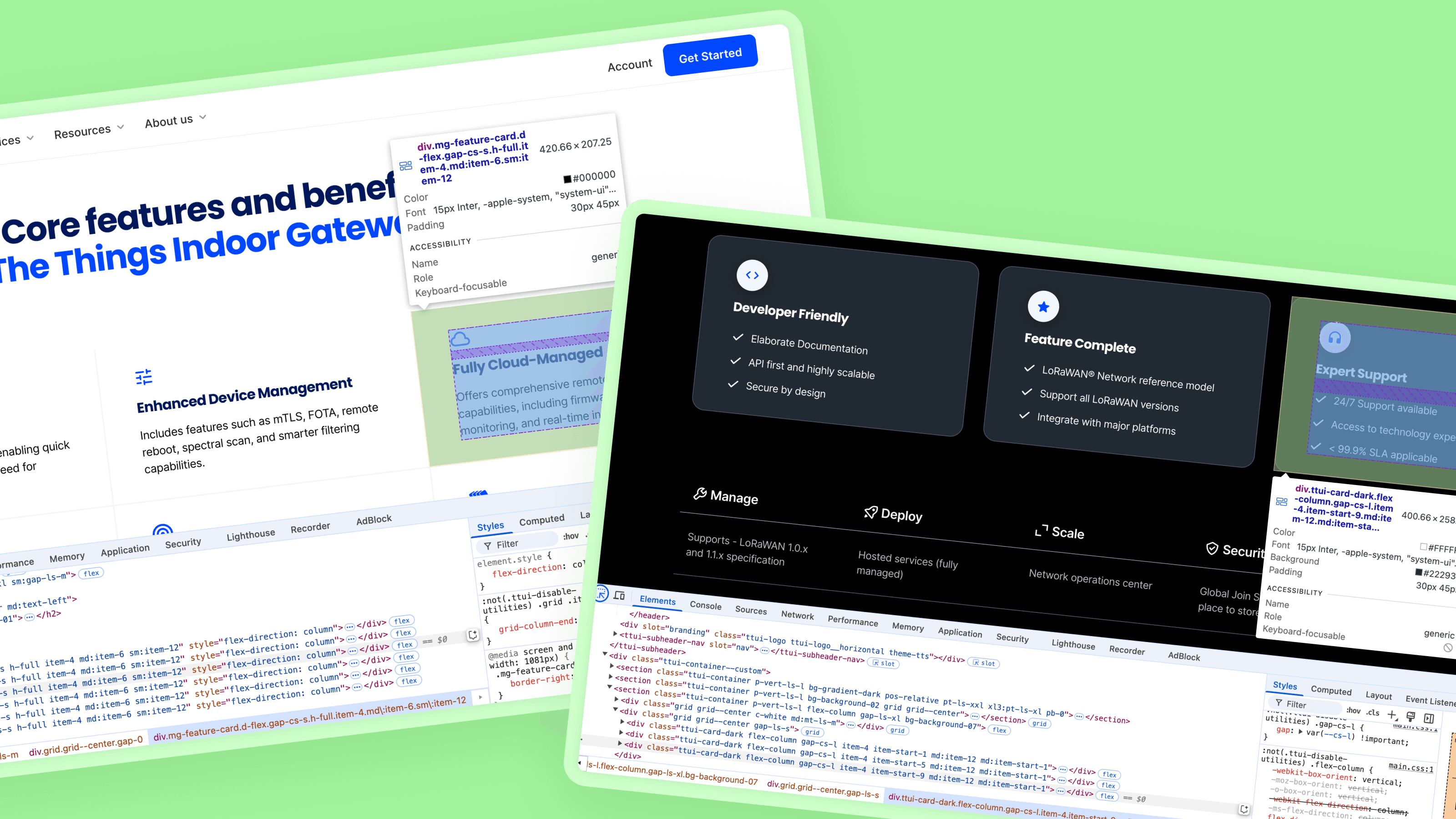
I defined the foundational elements of the design system — including typography scales, color tokens, spacing units, grid structures, and component behavior standards using  Figma. I crafted a comprehensive set of design assets, ranging from UI components and reusable patterns to responsive layout templates
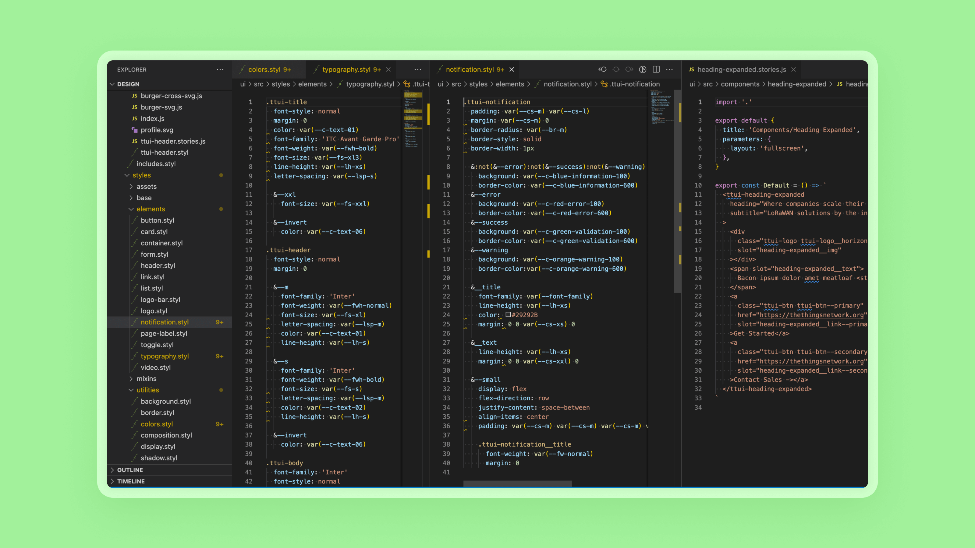
I translated each design rule into code tokens within our development environment, ensuring consistency and scalability across the UI. Working closely with developers with Visual Studio, we implemented design elements and components directly in React, contributing to the creation of a robust, reusable design library.
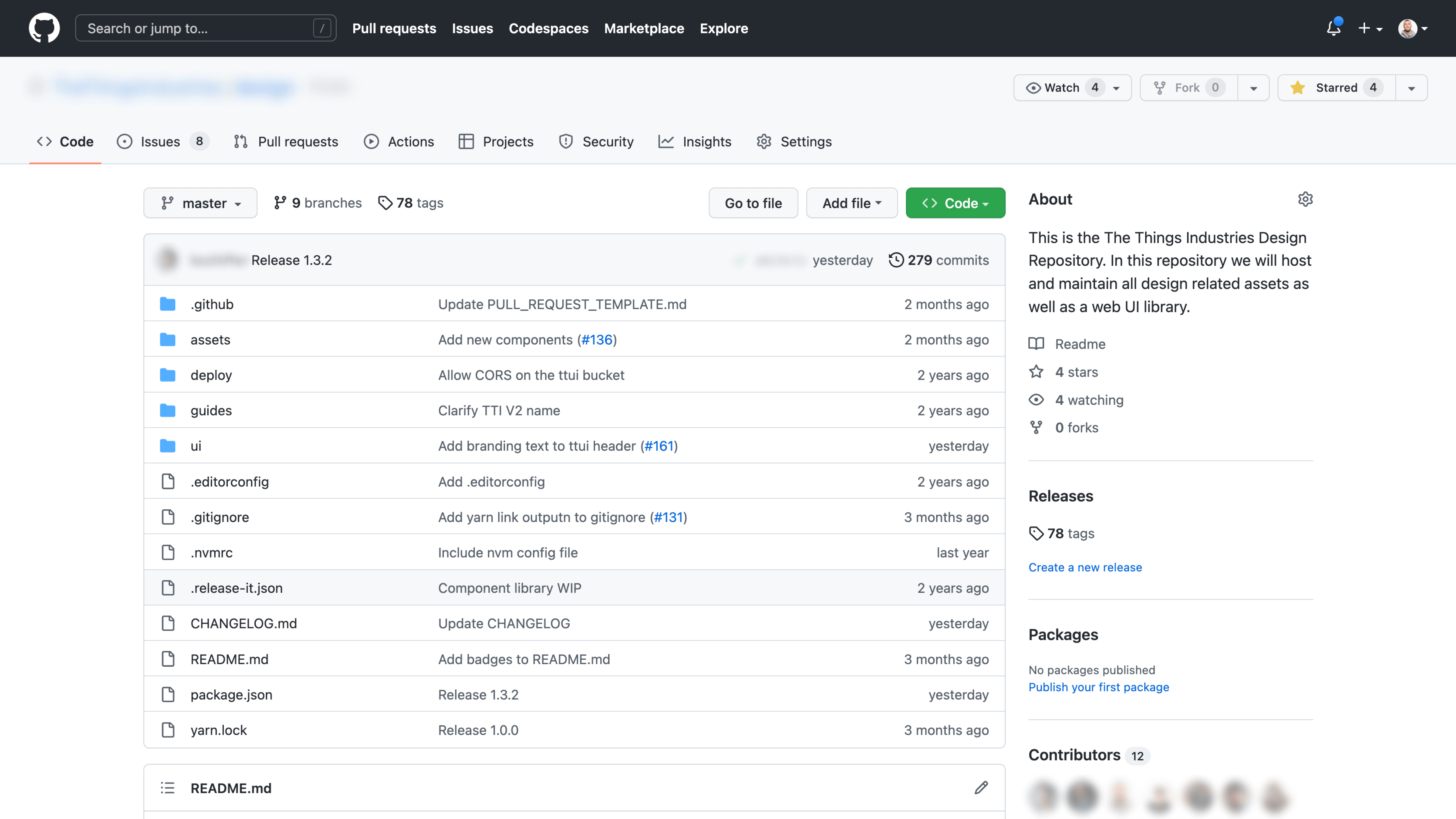
As a team, we maintain the design system as a living documentation on GitHub — continuously evolving it by introducing new components, extending the token library, and refining existing patterns to reflect product needs and design maturity.
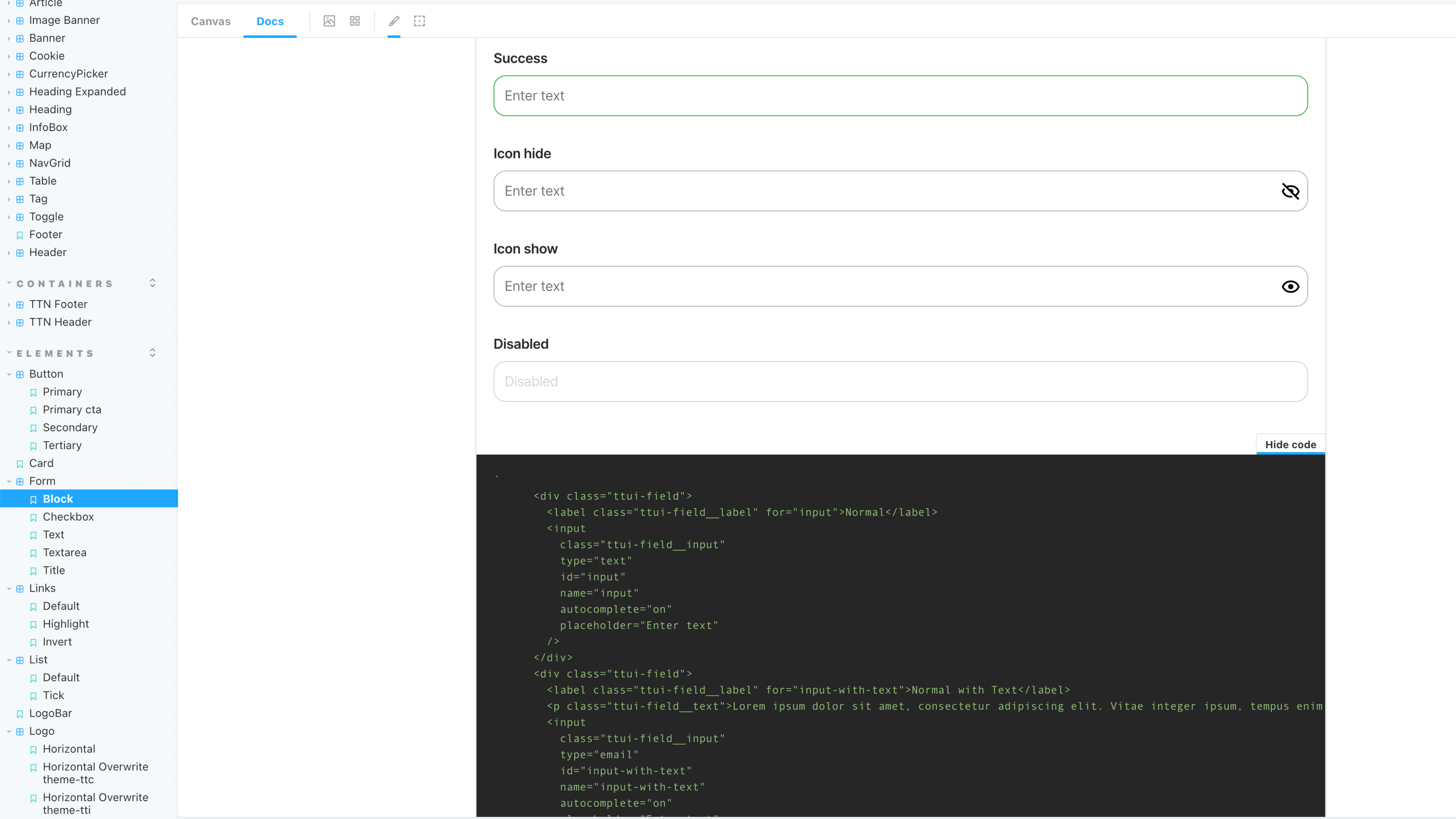
One of the key objectives of the design system is to streamline the developer workflow by providing ready-to-use, documented components and tokens directly within  Storybook — enabling seamless copy-paste integration and reducing implementation overhead.
By adopting the design system across multiple projects, we’ve significantly accelerated our development cycles while maintaining a consistent and cohesive user experience. The shared visual language and reusable components reduce design and implementation time, and ensure brand alignment across all products — allowing us to scale design with confidence and efficiency.
 Thank you for reading
More details available on request: pierre.philouze@gmail.com